KLST Responsive101 – Responsive Web Design Framework
Internet website Users today typically have a poor user experience when accessing websites only optimized for rendering on the PC or MAC. The default experience in SharePoint 2007 and 2010 for mobile is weak and many SharePoint Administrators turn off the mobile browsing experience at the request of the Marketing team. Even though the support for mobile rendering is greatly improved in SharePoint 2013, the common touch and gestures like pinch/zoom continue to pose challenges around resolution on limited mobile device screens as moving around to click on menus or see right aligned footer text will be challenging.
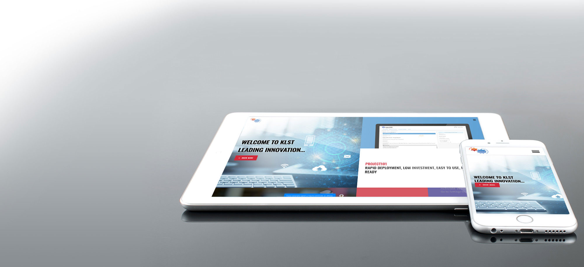
Using KLST Responsive101 Framework built on the Twitter Bootstrap, we can help you build 100% fluid Rich Responsive Web Design quickly. KLST Responsive101 is sleek, intuitive, and powerful front-end framework for faster and easier web development and provides all sorts great styling techniques that you can use to easily make your website fully responsive. If you are looking to rapidly re-build your website to be 100% Fluid Responsive then Contact Us, today to setup an introductory call to understand how KLST can help you with envisioning, design, implementation, testing and ongoing support of your next generation 100% Fluid Fully Responsive Website using SharePoint 2013 (hosted on-premises or on Microsoft 365).
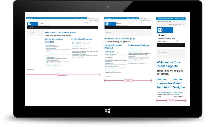
Refer to the image how using Responsive101 you can quickly convert a basic SharePoint 2013 website to display across multiple resolutions:
- 1200×1900 (desktop, portrait orientation)
- 768×1366 (tablet, portrait orientation)
- 480×800 (smartphone, portrait orientation)

