How to implement SharePoint 2013 Responsive Web Design (RWD)
SharePoint 2013 has been designed with mobile developers and web designers in mind to ensure that SharePoint 2013 websites are fully responsive. SharePoint Branding and UX customization experts are key to successfully building a Responsive Website.
At KLST we recommend starting the conversation around what content will be display and then focus on target devices so that the HTML5/CSS3 markup helps SharePoint render optimized webpages for changing set of displays. At KLST we look at building a site using Responsive web design principles as a fluid grid. The fluid, dynamic grid adapts itself to fit the information in display resolutions as different as those in a phone, a tablet, and a full desktop monitor. We pay close attention to the mix of display resolutions as it typically doubles when you consider landscape and portrait orientations available in all mobile devices.
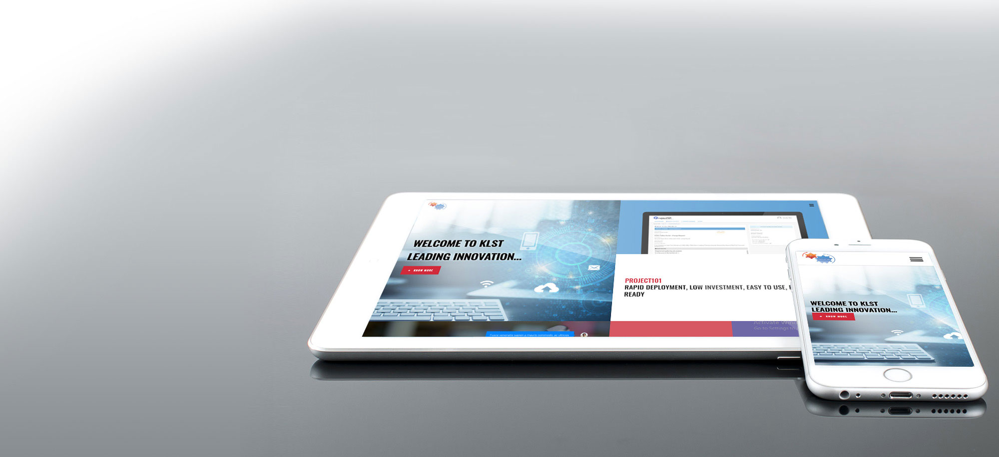
In our own corporate site (site you are currently browsing now) you will observe how the elements in the page rearrange themselves to fit the current resolution as you resize your browser window – go ahead and Try now. The way our website will adapt to changing resolution / browser window size will leave you wondering how a SharePoint website would react to different resolutions by using the fluid grid characteristic of responsive frameworks. Fortunately, with help from our expert SharePoint UX Architect “genius” and “wizards”, our “Responsive101” RWD Framework can help you design and implement your fully responsive SharePoint 2013 website rapidly.
There are also public RWD frameworks available for designing Responsive websites in SharePoint 2013 (for example – http://responsivesharepoint.codeplex.com). If you followed the included instructions to install the resources by using Design Manager on an out-of-the-box publishing test site. Within 10 minutes of following basic configuration steps, you would notice how the SharePoint 2013 website automatically adapts to display resolutions as the browser window is resized.
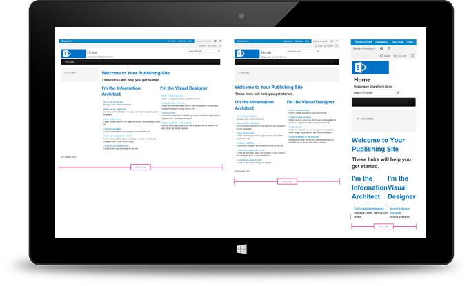
Refer to the image how it displays across multiple resolutions:
- 1200×1900 (Ddesktop, Portrait orientation)
- 768×1366 (Tablet, Portrait orientation)
- 480×800 (Smartphone, Portrait orientation)

