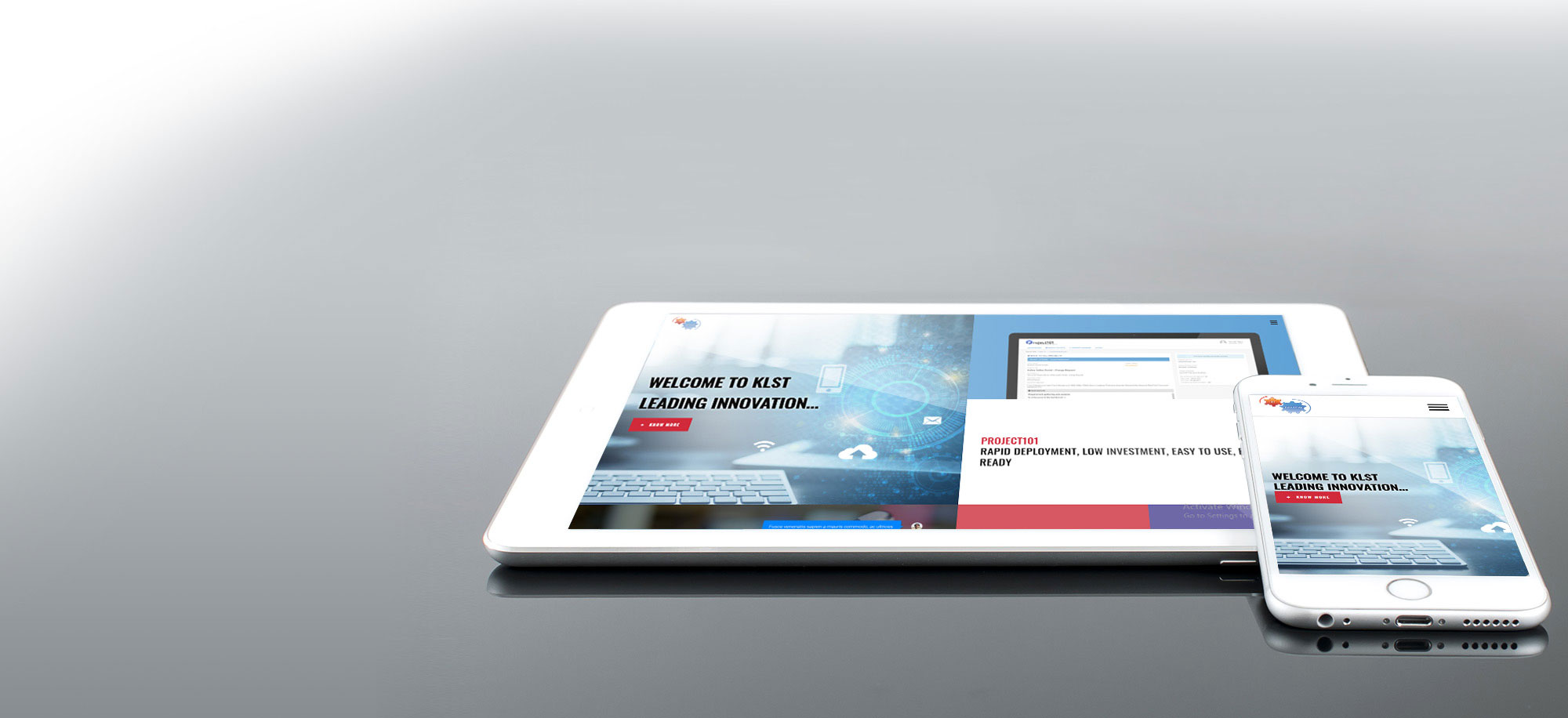
KLST Responsive101 – Responsive Web Design (RWD) HTML5 / CSS3 cheatsheet samples
The three key ingredients for Responsive Web Design are Fluid grids, flexible images, and media queries all backed by a different way of thinking. At KLST we beleive that rather than classifying your content into disparate, device-specific experiences, we can use media queries to progressively improve design within different viewing contexts. That’s not to say there isn’t a business case for separate sites geared toward specific devices, easily built using Microsoft SharePoint 2013 Device Channels; For example, if the user goals for your mobile site are more limited in scope than its desktop equivalent, then serving different content to each using focussed mobile and PC site might be a better approach. Contact Us today to understand how we can help you with envisioning, design and implementation of your 100% fluid RWD website on SharePoint 2013. Refer to the some tips and tricks below:
- A media query allows us to target not only certain device classes, but to actually inspect the physical characteristics of the device rendering our work:<link rel=”stylesheet” type=”text/css” media=”screen and (max-device-width: 480px)” href=”shetland.css” />
- For example, the ‘color’ media feature can form expressions without a value (‘(color)’), or with a value (‘(min-color: 1)’).
- This media query expresses that the style sheet is usable on devices with viewport (the part of the screen/paper where the document is rendered) widths between 400 and 700 pixels:@media screen and (min-width: 400px) and (max-width: 700px) { … }
- In the example below, the style sheet will apply only to screens that currently displays exactly 800 horizontal pixels. The ‘px’ unit is of the logical kind, as described in the Units section:@media screen and (device-width: 800px) { … }
- The ‘orientation’ media feature is ‘portrait’ when the value of the ‘height’ media feature is greater than or equal to the value of the ‘width’ media feature. Otherwise ‘orientation’ is ‘landscape’.
@media all and (orientation:portrait) { … }
@media all and (orientation:landscape) { … }
- When using HTML5, use <article> element instead of the <section> element when it would make sense to syndicate the contents of the element.
- <header> element is intended to usually contain the section’s heading (an h1–h6 element), but this is not required. The <header> element can also be used to wrap a section’s table of contents, a search form, or any relevant logos.

