Why KLST for Responsive Web Design (RWD)?
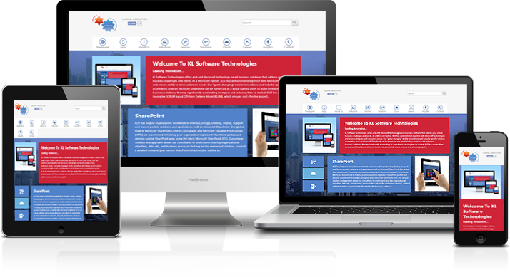 KL Software Technologies specializes in building websites designed with RWD concepts where the site can adapt the layout of the viewing environment by using fluid, proportion-based grids, flexible images, and CSS3 media queries. Using the CSS media queries capability implemented in all modern browsers, and based on the screen dimensions of the specific device, we load different style sheets to ensure that your website is presented in a user-friendly manner. And because CSS has its limitations, we use JavaScript to further optimize the interface and interaction of a website on mobile devices. Some of the key advantages of engaging KLST expertise to build rich SharePoint technology-based 100% Responsive websites are:
- KLST focusses on “user first based design”, which means that we focus on easy to use User Interface that adapts to the screen real estate of the device thereby resulting in an increased User Adoption (which means that your customers will “stick” to your website resulting in better conversion).
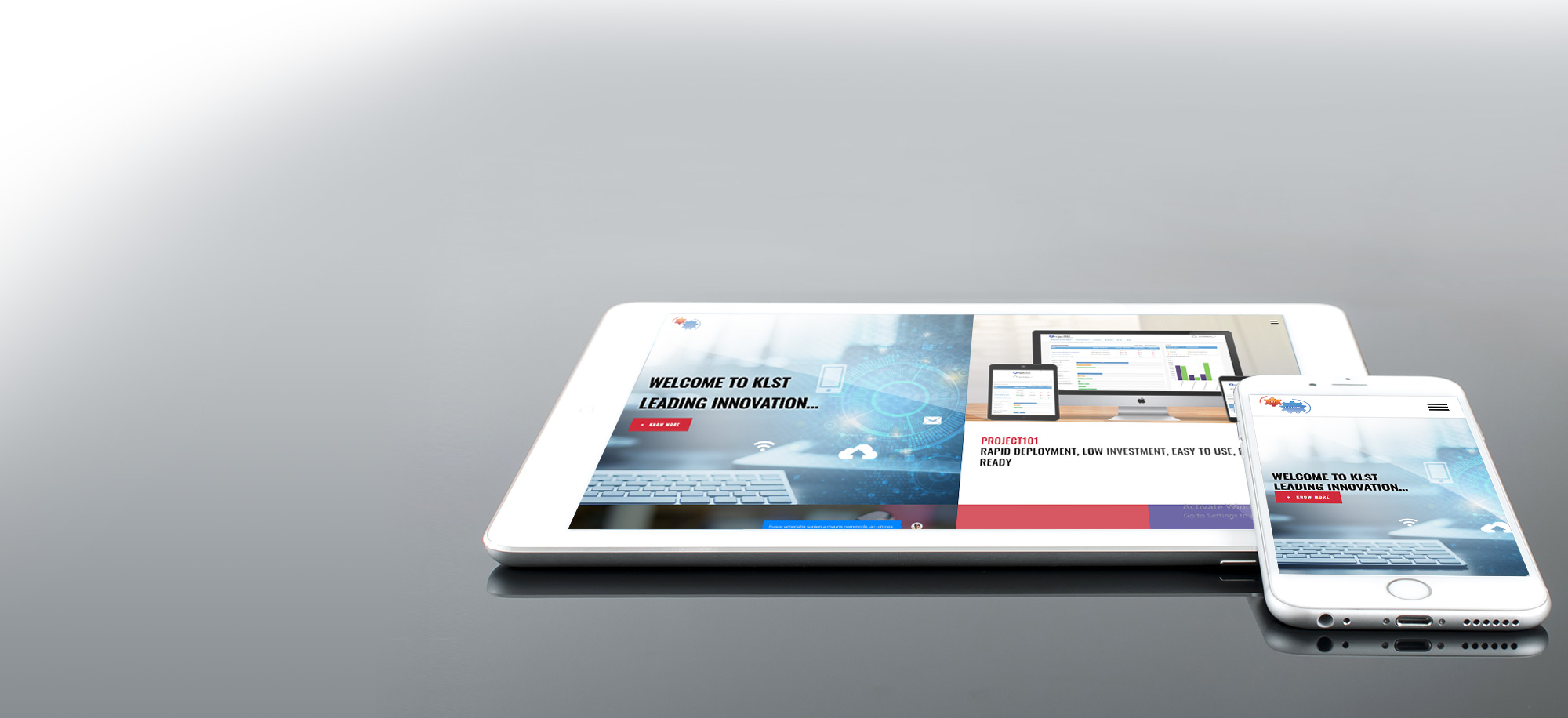
- KLST has built many responsive websites for our USA, Australian, and UK clients. Our best showcase of a 100% fluid Responsive Web Design that renders flawlessly on all modern mobile devices is KLST’s very own corporate website (this website that you are currently browsing – go on and browse our website on your Android/iPhone/iPad/Windows Tablet or phones and experience the KLST difference of building user-centric modern corporate websites using RWD best practices).
- KLST’s unique approach puts the business goals and objectives first for RWD followed by how content should be presented to potential customers across multiple devices. Our unique PC & Mobile Wireframing process allows you to review the site on paper before a full-build.
